From a design perspective, the photo is the strongest message of the prayer card.
You want to be sure the focal point of your prayer cards looks great! Here are a few tips to follow that will help your prayer cards look great and connect with your supporters.
Size Matters
For photos to work best with our prayer card designs we first look at the quality (size in MBs). I would not recommend sending photos that were taken from your phone. Pictures typically look really nice on our phones, but the size is often too small for a good quality print. Printing photos under 1 MB large will appear pixelated or fuzzy on paper. This is because the printer does not have enough information to print all the in between details. We recommend photos that are over 2 MB but sometimes smaller ones will do the trick as well (not under 1 MB though). If you have a small photo, go look for the original or check with your photographer. There may be a larger version out there. If you need to take a photo, go find a friend that has a nice camera to snap a photo of you or hire a photographer. It is worth it!
Give it space
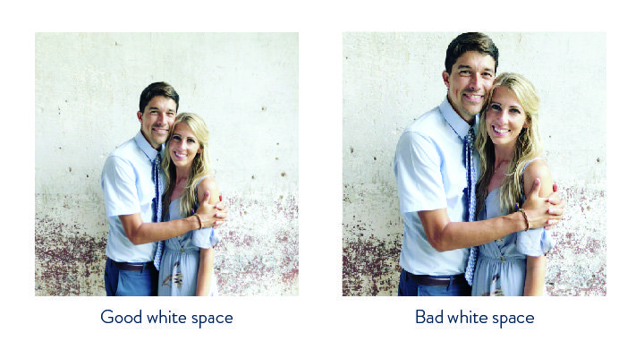
The second prayer card tip is having plenty of white space around the subject (you!). White space is not actual white space. It is what we designers like to call the areas where no important features are located. For photos used on the front of prayer cards, the only important objects in the photo should be you (or your family). Or maybe your dog you are taking with you to the Himalayas (actually happened). Or maybe a statue of Jesus you are side hugging (if that’s your style).
Some of our designs print your name and ministry information directly on the photo and we need the space to do it! We don’t want to print your name over your face. When a client delivers a photo with no white space, we have to get creative and “make” our own white space. If there is a nice repeating pattern (like a tree or similar consistent background) where text needs to go, we can photoshop the surroundings to give us more space. If the background is really busy and non-consistent, we have to resort to non-pretty options. These typically never make it to the Instagram showcase. Another option we could do is change the design. We could move the words from the top of the photo to the bottom of the photo and it works sometimes. But, if you are really set on the original design of the prayer card you ordered, just follow the tips above to have the best outcome.
Background: Keep it simple.
A third prayer card photo tip is to have a simple background. The best background is a consistent color. Dark woods, green bush, similar color building, blue sky…there are lots of options. As long as it is consistent, not a lot of light and dark colors. It is hard to pick a font color that will stand out from the background if it is too busy with colors. Inevitability, the font color will mix with background and make the words hard to make out.
What If…
So lets say you are stuck with a photo that has no white space, lots of busy colors, but is a decent size. We can get creative to make it work. We do it all the time. It just may not be the most ideal situation to match the original design.
If you are unsure about your photo, send it over to us! We can take a look and give you feedback before you order.